Building a Responsive Mega Menu Navbar with Tailwind CSS and Alpine.js
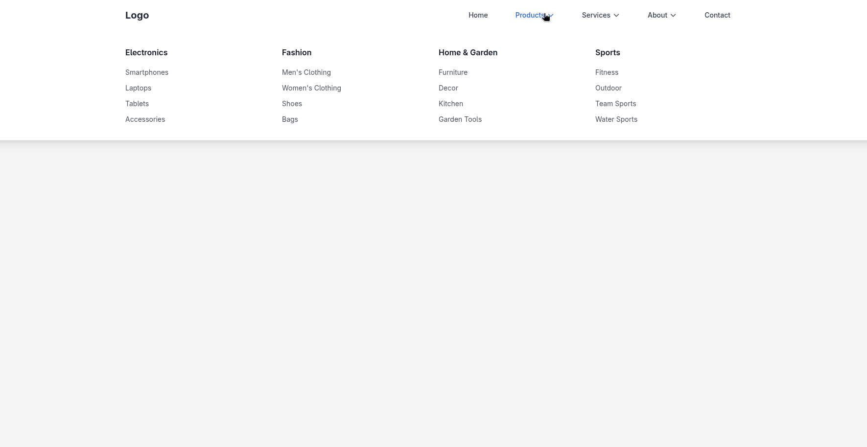
Navigation is one of the most important components of a website. For sites with many categories, a mega menu can present many options cleanly inside a large dropdown.
This article shows how to build a responsive navbar with mega menus using Tailwind CSS for styling and Alpine.js for interactive behavior.
Main Navbar Features
-
Desktop Navigation
- Main links: Home, Products, Services, About, Contact
- Mega menus for Products and Services
- A regular dropdown for About
-
Mobile Navigation
- Hamburger menu
- Click-to-toggle submenus
-
Interactivity
- Alpine.js manages menu state, transitions, and hover behavior.
Mega Menu Navbar
Copy the following code into an HTML file to try it:
<!DOCTYPE html>
<html lang="en">
<head>
<meta charset="UTF-8">
<meta name="viewport" content="width=device-width, initial-scale=1.0">
<title>Navbar Mega Menu</title>
<script src="https://cdn.tailwindcss.com"></script>
<script src="https://cdnjs.cloudflare.com/ajax/libs/alpinejs/3.13.3/cdn.min.js" defer></script>
<style>
[x-cloak] { display: none; }
</style>
</head>
<body class="bg-gray-100">
<nav class="bg-white shadow-lg relative" x-data="{
openMenu: null,
mobileMenuOpen: false,
mobileSubMenu: null,
hideTimeout: null,
showMenu(menu) {
if (this.hideTimeout) {
clearTimeout(this.hideTimeout);
this.hideTimeout = null;
}
this.openMenu = menu;
},
hideMenu() {
this.hideTimeout = setTimeout(() => {
this.openMenu = null;
}, 100);
},
keepMenu() {
if (this.hideTimeout) {
clearTimeout(this.hideTimeout);
this.hideTimeout = null;
}
},
toggleMobileMenu() {
this.mobileMenuOpen = !this.mobileMenuOpen;
if (!this.mobileMenuOpen) {
this.mobileSubMenu = null;
}
},
toggleMobileSubMenu(menu) {
this.mobileSubMenu = this.mobileSubMenu === menu ? null : menu;
}
}">
<div class="max-w-7xl mx-auto px-4">
<div class="flex justify-between items-center h-16">
<div class="flex items-center">
<div class="text-xl font-bold text-gray-800">
Logo
</div>
</div>
<div class="hidden md:flex items-center space-x-8">
<a href="#" class="text-gray-700 hover:text-blue-600 px-3 py-2 text-sm font-medium">
Home
</a>
<div class="relative">
<button
@mouseenter="showMenu('products')"
@mouseleave="hideMenu()"
class="text-gray-700 hover:text-blue-600 px-3 py-2 text-sm font-medium flex items-center"
>
Products
<svg class="ml-1 h-4 w-4" fill="none" stroke="currentColor" viewBox="0 0 24 24">
<path stroke-linecap="round" stroke-linejoin="round" stroke-width="2" d="M19 9l-7 7-7-7"></path>
</svg>
</button>
</div>
<div class="relative">
<button
@mouseenter="showMenu('services')"
@mouseleave="hideMenu()"
class="text-gray-700 hover:text-blue-600 px-3 py-2 text-sm font-medium flex items-center"
>
Services
<svg class="ml-1 h-4 w-4" fill="none" stroke="currentColor" viewBox="0 0 24 24">
<path stroke-linecap="round" stroke-linejoin="round" stroke-width="2" d="M19 9l-7 7-7-7"></path>
</svg>
</button>
</div>
<!-- Keep the About dropdown inside its positioned wrapper -->
<div class="relative">
<button
@mouseenter="showMenu('about')"
@mouseleave="hideMenu()"
class="text-gray-700 hover:text-blue-600 px-3 py-2 text-sm font-medium flex items-center"
>
About
<svg class="ml-1 h-4 w-4" fill="none" stroke="currentColor" viewBox="0 0 24 24">
<path stroke-linecap="round" stroke-linejoin="round" stroke-width="2" d="M19 9l-7 7-7-7"></path>
</svg>
</button>
<!-- About regular dropdown menu -->
<div
x-cloak
x-show="openMenu === 'about'"
x-transition:enter="transition ease-out duration-300"
x-transition:enter-start="opacity-0 transform -translate-y-2"
x-transition:enter-end="opacity-100 transform translate-y-0"
x-transition:leave="transition ease-in duration-200"
x-transition:leave-start="opacity-100 transform translate-y-0"
x-transition:leave-end="opacity-0 transform -translate-y-2"
@mouseenter="keepMenu()"
@mouseleave="hideMenu()"
class="absolute left-0 mt-2 w-48 bg-white rounded-md shadow-lg py-2 z-50"
>
<a href="#" class="block px-4 py-2 text-sm text-gray-700 hover:bg-gray-100 hover:text-blue-600">Our Story</a>
<a href="#" class="block px-4 py-2 text-sm text-gray-700 hover:bg-gray-100 hover:text-blue-600">Team</a>
<a href="#" class="block px-4 py-2 text-sm text-gray-700 hover:bg-gray-100 hover:text-blue-600">Careers</a>
<a href="#" class="block px-4 py-2 text-sm text-gray-700 hover:bg-gray-100 hover:text-blue-600">Mission & Vision</a>
<a href="#" class="block px-4 py-2 text-sm text-gray-700 hover:bg-gray-100 hover:text-blue-600">Awards</a>
</div>
</div>
<a href="#" class="text-gray-700 hover:text-blue-600 px-3 py-2 text-sm font-medium">
Contact
</a>
</div>
<div class="md:hidden">
<button
@click="toggleMobileMenu()"
class="text-gray-700 hover:text-blue-600 p-2"
>
<svg class="h-6 w-6" fill="none" stroke="currentColor" viewBox="0 0 24 24">
<path stroke-linecap="round" stroke-linejoin="round" stroke-width="2" d="M4 6h16M4 12h16M4 18h16"></path>
</svg>
</button>
</div>
</div>
</div>
<!-- Products Mega Menu -->
<div
x-cloak
x-show="openMenu === 'products'"
x-transition:enter="transition ease-out duration-300"
x-transition:enter-start="opacity-0 transform -translate-y-2"
x-transition:enter-end="opacity-100 transform translate-y-0"
x-transition:leave="transition ease-in duration-200"
x-transition:leave-start="opacity-100 transform translate-y-0"
x-transition:leave-end="opacity-0 transform -translate-y-2"
@mouseenter="keepMenu()"
@mouseleave="hideMenu()"
class="absolute left-0 w-full bg-white shadow-lg z-50 top-full"
>
<div class="max-w-7xl mx-auto px-4 py-8">
<div class="grid grid-cols-1 md:grid-cols-4 gap-8">
<div>
<h3 class="font-semibold text-gray-900 mb-4">Electronics</h3>
<ul class="space-y-2">
<li><a href="#" class="text-gray-600 hover:text-blue-600 text-sm">Smartphones</a></li>
<li><a href="#" class="text-gray-600 hover:text-blue-600 text-sm">Laptops</a></li>
<li><a href="#" class="text-gray-600 hover:text-blue-600 text-sm">Tablets</a></li>
<li><a href="#" class="text-gray-600 hover:text-blue-600 text-sm">Accessories</a></li>
</ul>
</div>
<div>
<h3 class="font-semibold text-gray-900 mb-4">Fashion</h3>
<ul class="space-y-2">
<li><a href="#" class="text-gray-600 hover:text-blue-600 text-sm">Men's Clothing</a></li>
<li><a href="#" class="text-gray-600 hover:text-blue-600 text-sm">Women's Clothing</a></li>
<li><a href="#" class="text-gray-600 hover:text-blue-600 text-sm">Shoes</a></li>
<li><a href="#" class="text-gray-600 hover:text-blue-600 text-sm">Bags</a></li>
</ul>
</div>
<div>
<h3 class="font-semibold text-gray-900 mb-4">Home & Garden</h3>
<ul class="space-y-2">
<li><a href="#" class="text-gray-600 hover:text-blue-600 text-sm">Furniture</a></li>
<li><a href="#" class="text-gray-600 hover:text-blue-600 text-sm">Decor</a></li>
<li><a href="#" class="text-gray-600 hover:text-blue-600 text-sm">Kitchen</a></li>
<li><a href="#" class="text-gray-600 hover:text-blue-600 text-sm">Garden Tools</a></li>
</ul>
</div>
<div>
<h3 class="font-semibold text-gray-900 mb-4">Sports</h3>
<ul class="space-y-2">
<li><a href="#" class="text-gray-600 hover:text-blue-600 text-sm">Fitness</a></li>
<li><a href="#" class="text-gray-600 hover:text-blue-600 text-sm">Outdoor</a></li>
<li><a href="#" class="text-gray-600 hover:text-blue-600 text-sm">Team Sports</a></li>
<li><a href="#" class="text-gray-600 hover:text-blue-600 text-sm">Water Sports</a></li>
</ul>
</div>
</div>
</div>
</div>
<!-- Services Mega Menu -->
<div
x-cloak
x-show="openMenu === 'services'"
x-transition:enter="transition ease-out duration-300"
x-transition:enter-start="opacity-0 transform -translate-y-2"
x-transition:enter-end="opacity-100 transform translate-y-0"
x-transition:leave="transition ease-in duration-200"
x-transition:leave-start="opacity-100 transform translate-y-0"
x-transition:leave-end="opacity-0 transform -translate-y-2"
@mouseenter="keepMenu()"
@mouseleave="hideMenu()"
class="absolute left-0 w-full bg-white shadow-lg z-50 top-full"
>
<div class="max-w-7xl mx-auto px-4 py-8">
<div class="grid grid-cols-1 md:grid-cols-3 gap-8">
<div>
<h3 class="font-semibold text-gray-900 mb-4">Web Services</h3>
<ul class="space-y-2">
<li><a href="#" class="text-gray-600 hover:text-blue-600 text-sm">Web Design</a></li>
<li><a href="#" class="text-gray-600 hover:text-blue-600 text-sm">Web Development</a></li>
<li><a href="#" class="text-gray-600 hover:text-blue-600 text-sm">E-commerce</a></li>
<li><a href="#" class="text-gray-600 hover:text-blue-600 text-sm">Maintenance</a></li>
</ul>
</div>
<div>
<h3 class="font-semibold text-gray-900 mb-4">Digital Marketing</h3>
<ul class="space-y-2">
<li><a href="#" class="text-gray-600 hover:text-blue-600 text-sm">SEO</a></li>
<li><a href="#" class="text-gray-600 hover:text-blue-600 text-sm">Social Media</a></li>
<li><a href="#" class="text-gray-600 hover:text-blue-600 text-sm">PPC Advertising</a></li>
<li><a href="#" class="text-gray-600 hover:text-blue-600 text-sm">Content Marketing</a></li>
</ul>
</div>
<div>
<h3 class="font-semibold text-gray-900 mb-4">Consulting</h3>
<ul class="space-y-2">
<li><a href="#" class="text-gray-600 hover:text-blue-600 text-sm">Business Strategy</a></li>
<li><a href="#" class="text-gray-600 hover:text-blue-600 text-sm">IT Consulting</a></li>
<li><a href="#" class="text-gray-600 hover:text-blue-600 text-sm">Digital Transformation</a></li>
<li><a href="#" class="text-gray-600 hover:text-blue-600 text-sm">Training</a></li>
</ul>
</div>
</div>
</div>
</div>
<!-- Mobile Menu -->
<div
x-cloak
x-show="mobileMenuOpen"
x-transition:enter="transition ease-out duration-300"
x-transition:enter-start="opacity-0 max-h-0 overflow-hidden"
x-transition:enter-end="opacity-100 max-h-screen overflow-visible"
x-transition:leave="transition ease-in duration-200"
x-transition:leave-start="opacity-100 max-h-screen overflow-visible"
x-transition:leave-end="opacity-0 max-h-0 overflow-hidden"
class="md:hidden bg-white"
>
<div class="px-4 py-4 space-y-2">
<a href="#" class="block text-gray-700 hover:text-blue-600 py-2">Home</a>
<div>
<button
@click="toggleMobileSubMenu('products')"
class="w-full flex justify-between items-center text-gray-700 hover:text-blue-600 py-2"
>
<span>Products</span>
<svg
class="h-4 w-4 transform transition-transform duration-200"
:class="mobileSubMenu === 'products' ? 'rotate-180' : ''"
fill="none" stroke="currentColor" viewBox="0 0 24 24"
>
<path stroke-linecap="round" stroke-linejoin="round" stroke-width="2" d="M19 9l-7 7-7-7"></path>
</svg>
</button>
<div
x-cloak
x-show="mobileSubMenu === 'products'"
x-transition:enter="transition ease-out duration-300"
x-transition:enter-start="opacity-0 max-h-0 overflow-hidden"
x-transition:enter-end="opacity-100 max-h-screen overflow-visible"
x-transition:leave="transition ease-in duration-200"
x-transition:leave-start="opacity-100 max-h-screen overflow-visible"
x-transition:leave-end="opacity-0 max-h-0 overflow-hidden"
class="bg-gray-50"
>
<div class="pl-4 py-2 space-y-4">
<div>
<h4 class="font-semibold text-gray-900 text-sm mb-2">Electronics</h4>
<div class="space-y-1">
<a href="#" class="block text-gray-600 hover:text-blue-600 text-sm py-1 pl-2">Smartphones</a>
<a href="#" class="block text-gray-600 hover:text-blue-600 text-sm py-1 pl-2">Laptops</a>
<a href="#" class="block text-gray-600 hover:text-blue-600 text-sm py-1 pl-2">Tablets</a>
<a href="#" class="block text-gray-600 hover:text-blue-600 text-sm py-1 pl-2">Accessories</a>
</div>
</div>
<div>
<h4 class="font-semibold text-gray-900 text-sm mb-2">Fashion</h4>
<div class="space-y-1">
<a href="#" class="block text-gray-600 hover:text-blue-600 text-sm py-1 pl-2">Men's Clothing</a>
<a href="#" class="block text-gray-600 hover:text-blue-600 text-sm py-1 pl-2">Women's Clothing</a>
<a href="#" class="block text-gray-600 hover:text-blue-600 text-sm py-1 pl-2">Shoes</a>
<a href="#" class="block text-gray-600 hover:text-blue-600 text-sm py-1 pl-2">Bags</a>
</div>
</div>
<div>
<h4 class="font-semibold text-gray-900 text-sm mb-2">Home & Garden</h4>
<div class="space-y-1">
<a href="#" class="block text-gray-600 hover:text-blue-600 text-sm py-1 pl-2">Furniture</a>
<a href="#" class="block text-gray-600 hover:text-blue-600 text-sm py-1 pl-2">Decor</a>
<a href="#" class="block text-gray-600 hover:text-blue-600 text-sm py-1 pl-2">Kitchen</a>
<a href="#" class="block text-gray-600 hover:text-blue-600 text-sm py-1 pl-2">Garden Tools</a>
</div>
</div>
<div>
<h4 class="font-semibold text-gray-900 text-sm mb-2">Sports</h4>
<div class="space-y-1">
<a href="#" class="block text-gray-600 hover:text-blue-600 text-sm py-1 pl-2">Fitness</a>
<a href="#" class="block text-gray-600 hover:text-blue-600 text-sm py-1 pl-2">Outdoor</a>
<a href="#" class="block text-gray-600 hover:text-blue-600 text-sm py-1 pl-2">Team Sports</a>
<a href="#" class="block text-gray-600 hover:text-blue-600 text-sm py-1 pl-2">Water Sports</a>
</div>
</div>
</div>
</div>
</div>
<div>
<button
@click="toggleMobileSubMenu('services')"
class="w-full flex justify-between items-center text-gray-700 hover:text-blue-600 py-2"
>
<span>Services</span>
<svg
class="h-4 w-4 transform transition-transform duration-200"
:class="mobileSubMenu === 'services' ? 'rotate-180' : ''"
fill="none" stroke="currentColor" viewBox="0 0 24 24"
>
<path stroke-linecap="round" stroke-linejoin="round" stroke-width="2" d="M19 9l-7 7-7-7"></path>
</svg>
</button>
<div
x-cloak
x-show="mobileSubMenu === 'services'"
x-transition:enter="transition ease-out duration-300"
x-transition:enter-start="opacity-0 max-h-0 overflow-hidden"
x-transition:enter-end="opacity-100 max-h-screen overflow-visible"
x-transition:leave="transition ease-in duration-200"
x-transition:leave-start="opacity-100 max-h-screen overflow-visible"
x-transition:leave-end="opacity-0 max-h-0 overflow-hidden"
class="bg-gray-50"
>
<div class="pl-4 py-2 space-y-4">
<div>
<h4 class="font-semibold text-gray-900 text-sm mb-2">Web Services</h4>
<div class="space-y-1">
<a href="#" class="block text-gray-600 hover:text-blue-600 text-sm py-1 pl-2">Web Design</a>
<a href="#" class="block text-gray-600 hover:text-blue-600 text-sm py-1 pl-2">Web Development</a>
<a href="#" class="block text-gray-600 hover:text-blue-600 text-sm py-1 pl-2">E-commerce</a>
<a href="#" class="block text-gray-600 hover:text-blue-600 text-sm py-1 pl-2">Maintenance</a>
</div>
</div>
<div>
<h4 class="font-semibold text-gray-900 text-sm mb-2">Digital Marketing</h4>
<div class="space-y-1">
<a href="#" class="block text-gray-600 hover:text-blue-600 text-sm py-1 pl-2">SEO</a>
<a href="#" class="block text-gray-600 hover:text-blue-600 text-sm py-1 pl-2">Social Media</a>
<a href="#" class="block text-gray-600 hover:text-blue-600 text-sm py-1 pl-2">PPC Advertising</a>
<a href="#" class="block text-gray-600 hover:text-blue-600 text-sm py-1 pl-2">Content Marketing</a>
</div>
</div>
<div>
<h4 class="font-semibold text-gray-900 text-sm mb-2">Consulting</h4>
<div class="space-y-1">
<a href="#" class="block text-gray-600 hover:text-blue-600 text-sm py-1 pl-2">Business Strategy</a>
<a href="#" class="block text-gray-600 hover:text-blue-600 text-sm py-1 pl-2">IT Consulting</a>
<a href="#" class="block text-gray-600 hover:text-blue-600 text-sm py-1 pl-2">Digital Transformation</a>
<a href="#" class="block text-gray-600 hover:text-blue-600 text-sm py-1 pl-2">Training</a>
</div>
</div>
</div>
</div>
</div>
<div>
<button
@click="toggleMobileSubMenu('about')"
class="w-full flex justify-between items-center text-gray-700 hover:text-blue-600 py-2"
>
<span>About</span>
<svg
class="h-4 w-4 transform transition-transform duration-200"
:class="mobileSubMenu === 'about' ? 'rotate-180' : ''"
fill="none" stroke="currentColor" viewBox="0 0 24 24"
>
<path stroke-linecap="round" stroke-linejoin="round" stroke-width="2" d="M19 9l-7 7-7-7"></path>
</svg>
</button>
<div
x-cloak
x-show="mobileSubMenu === 'about'"
x-transition:enter="transition ease-out duration-300"
x-transition:enter-start="opacity-0 max-h-0 overflow-hidden"
x-transition:enter-end="opacity-100 max-h-screen overflow-visible"
x-transition:leave="transition ease-in duration-200"
x-transition:leave-start="opacity-100 max-h-screen overflow-visible"
x-transition:leave-end="opacity-0 max-h-0 overflow-hidden"
class="bg-gray-50"
>
<div class="pl-4 py-2 space-y-1">
<a href="#" class="block text-gray-600 hover:text-blue-600 text-sm py-1 pl-2">Our Story</a>
<a href="#" class="block text-gray-600 hover:text-blue-600 text-sm py-1 pl-2">Team</a>
<a href="#" class="block text-gray-600 hover:text-blue-600 text-sm py-1 pl-2">Careers</a>
<a href="#" class="block text-gray-600 hover:text-blue-600 text-sm py-1 pl-2">Mission & Vision</a>
<a href="#" class="block text-gray-600 hover:text-blue-600 text-sm py-1 pl-2">Awards</a>
</div>
</div>
</div>
<a href="#" class="block text-gray-700 hover:text-blue-600 py-2">Contact</a>
</div>
</div>
</nav>
<div class="max-w-7xl mx-auto px-4 py-12">
<h1 class="text-3xl font-bold text-gray-900 mb-6">Navbar with Dropdowns</h1>
</div>
<div class="h-96"></div>
</body>
</html>How the Interaction Works
The Alpine component keeps desktop and mobile state separately. openMenu controls the desktop dropdown, while mobileMenuOpen and mobileSubMenu control the collapsible mobile navigation. A short timeout prevents the desktop menu from disappearing immediately while the pointer moves from a trigger into its dropdown.
x-cloak prevents Alpine-controlled elements from flashing before Alpine initializes, while x-show and x-transition handle visibility and animation.
For a production navbar, also consider keyboard navigation, focus management, aria-expanded, aria-controls, and escape-key handling so the menu is accessible without a mouse.
Conclusion
Tailwind CSS and Alpine.js work well together for a lightweight, responsive mega-menu navbar. Tailwind handles layout and responsive styling, while Alpine manages state and transitions without requiring a larger JavaScript framework. The structure can be adapted for e-commerce sites, company websites, documentation portals, or other navigation-heavy interfaces.