Membuat Navbar Mega Menu Responsif dengan Tailwind CSS dan Alpine.js
7
min read .
Published on
Navigasi adalah salah satu komponen terpenting dalam sebuah website. Untuk situs dengan banyak kategori, mega menu menjadi pilihan ideal karena mampu menampilkan banyak opsi secara rapi dalam satu dropdown besar.
Pada artikel ini kita akan membahas bagaimana cara membuat navbar dengan mega menu responsif menggunakan Tailwind CSS untuk styling dan Alpine.js untuk logika interaktif.
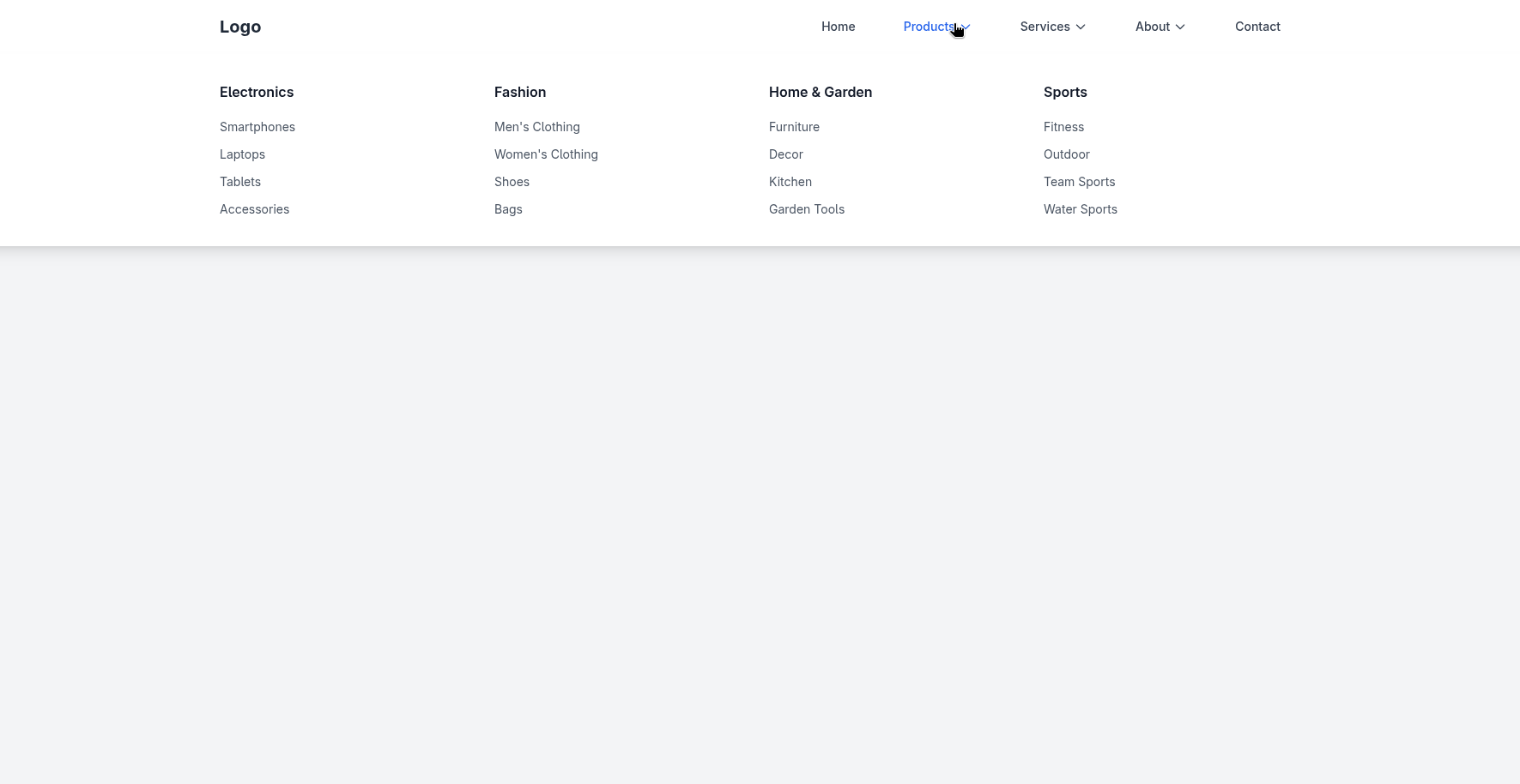
Fitur Utama Navbar
-
Desktop Navigation
- Menu utama: Home, Products, Services, About, Contact
- Mega menu untuk Products dan Services
- Dropdown sederhana untuk About
-
Mobile Navigation
- Hamburger menu
- Submenu dapat dibuka/tutup dengan klik
-
Interaktivitas
- Alpine.js digunakan untuk toggle menu, animasi transisi, dan hover effect.
Navbar Mega Menu
Salin kode berikut untuk mencoba langsung:
<!DOCTYPE html>
<html lang="id">
<head>
<meta charset="UTF-8">
<meta name="viewport" content="width=device-width, initial-scale=1.0">
<title>Navbar Mega Menu</title>
<script src="https://cdn.tailwindcss.com"></script>
<script src="https://cdnjs.cloudflare.com/ajax/libs/alpinejs/3.13.3/cdn.min.js" defer></script>
<style>
[x-cloak] { display: none; }
</style>
</head>
<body class="bg-gray-100">
<nav class="bg-white shadow-lg relative" x-data="{
openMenu: null,
mobileMenuOpen: false,
mobileSubMenu: null,
hideTimeout: null,
showMenu(menu) {
if (this.hideTimeout) {
clearTimeout(this.hideTimeout);
this.hideTimeout = null;
}
this.openMenu = menu;
},
hideMenu() {
this.hideTimeout = setTimeout(() => {
this.openMenu = null;
}, 100);
},
keepMenu() {
if (this.hideTimeout) {
clearTimeout(this.hideTimeout);
this.hideTimeout = null;
}
},
toggleMobileMenu() {
this.mobileMenuOpen = !this.mobileMenuOpen;
if (!this.mobileMenuOpen) {
this.mobileSubMenu = null;
}
},
toggleMobileSubMenu(menu) {
this.mobileSubMenu = this.mobileSubMenu === menu ? null : menu;
}
}">
<div class="max-w-7xl mx-auto px-4">
<div class="flex justify-between items-center h-16">
<div class="flex items-center">
<div class="text-xl font-bold text-gray-800">
Logo
</div>
</div>
<div class="hidden md:flex items-center space-x-8">
<a href="#" class="text-gray-700 hover:text-blue-600 px-3 py-2 text-sm font-medium">
Home
</a>
<div class="relative">
<button
@mouseenter="showMenu('products')"
@mouseleave="hideMenu()"
class="text-gray-700 hover:text-blue-600 px-3 py-2 text-sm font-medium flex items-center"
>
Products
<svg class="ml-1 h-4 w-4" fill="none" stroke="currentColor" viewBox="0 0 24 24">
<path stroke-linecap="round" stroke-linejoin="round" stroke-width="2" d="M19 9l-7 7-7-7"></path>
</svg>
</button>
</div>
<div class="relative">
<button
@mouseenter="showMenu('services')"
@mouseleave="hideMenu()"
class="text-gray-700 hover:text-blue-600 px-3 py-2 text-sm font-medium flex items-center"
>
Services
<svg class="ml-1 h-4 w-4" fill="none" stroke="currentColor" viewBox="0 0 24 24">
<path stroke-linecap="round" stroke-linejoin="round" stroke-width="2" d="M19 9l-7 7-7-7"></path>
</svg>
</button>
</div>
<!-- Perbaikan: Pindahkan dropdown About ke dalam div pembungkus -->
<div class="relative">
<button
@mouseenter="showMenu('about')"
@mouseleave="hideMenu()"
class="text-gray-700 hover:text-blue-600 px-3 py-2 text-sm font-medium flex items-center"
>
About
<svg class="ml-1 h-4 w-4" fill="none" stroke="currentColor" viewBox="0 0 24 24">
<path stroke-linecap="round" stroke-linejoin="round" stroke-width="2" d="M19 9l-7 7-7-7"></path>
</svg>
</button>
<!-- About Regular Dropdown Menu - Dipindahkan ke sini -->
<div
x-cloak
x-show="openMenu === 'about'"
x-transition:enter="transition ease-out duration-300"
x-transition:enter-start="opacity-0 transform -translate-y-2"
x-transition:enter-end="opacity-100 transform translate-y-0"
x-transition:leave="transition ease-in duration-200"
x-transition:leave-start="opacity-100 transform translate-y-0"
x-transition:leave-end="opacity-0 transform -translate-y-2"
@mouseenter="keepMenu()"
@mouseleave="hideMenu()"
class="absolute left-0 mt-2 w-48 bg-white rounded-md shadow-lg py-2 z-50"
>
<a href="#" class="block px-4 py-2 text-sm text-gray-700 hover:bg-gray-100 hover:text-blue-600">Our Story</a>
<a href="#" class="block px-4 py-2 text-sm text-gray-700 hover:bg-gray-100 hover:text-blue-600">Team</a>
<a href="#" class="block px-4 py-2 text-sm text-gray-700 hover:bg-gray-100 hover:text-blue-600">Careers</a>
<a href="#" class="block px-4 py-2 text-sm text-gray-700 hover:bg-gray-100 hover:text-blue-600">Mission & Vision</a>
<a href="#" class="block px-4 py-2 text-sm text-gray-700 hover:bg-gray-100 hover:text-blue-600">Awards</a>
</div>
</div>
<a href="#" class="text-gray-700 hover:text-blue-600 px-3 py-2 text-sm font-medium">
Contact
</a>
</div>
<div class="md:hidden">
<button
@click="toggleMobileMenu()"
class="text-gray-700 hover:text-blue-600 p-2"
>
<svg class="h-6 w-6" fill="none" stroke="currentColor" viewBox="0 0 24 24">
<path stroke-linecap="round" stroke-linejoin="round" stroke-width="2" d="M4 6h16M4 12h16M4 18h16"></path>
</svg>
</button>
</div>
</div>
</div>
<!-- Products Mega Menu -->
<div
x-cloak
x-show="openMenu === 'products'"
x-transition:enter="transition ease-out duration-300"
x-transition:enter-start="opacity-0 transform -translate-y-2"
x-transition:enter-end="opacity-100 transform translate-y-0"
x-transition:leave="transition ease-in duration-200"
x-transition:leave-start="opacity-100 transform translate-y-0"
x-transition:leave-end="opacity-0 transform -translate-y-2"
@mouseenter="keepMenu()"
@mouseleave="hideMenu()"
class="absolute left-0 w-full bg-white shadow-lg z-50 top-full"
>
<div class="max-w-7xl mx-auto px-4 py-8">
<div class="grid grid-cols-1 md:grid-cols-4 gap-8">
<div>
<h3 class="font-semibold text-gray-900 mb-4">Electronics</h3>
<ul class="space-y-2">
<li><a href="#" class="text-gray-600 hover:text-blue-600 text-sm">Smartphones</a></li>
<li><a href="#" class="text-gray-600 hover:text-blue-600 text-sm">Laptops</a></li>
<li><a href="#" class="text-gray-600 hover:text-blue-600 text-sm">Tablets</a></li>
<li><a href="#" class="text-gray-600 hover:text-blue-600 text-sm">Accessories</a></li>
</ul>
</div>
<div>
<h3 class="font-semibold text-gray-900 mb-4">Fashion</h3>
<ul class="space-y-2">
<li><a href="#" class="text-gray-600 hover:text-blue-600 text-sm">Men's Clothing</a></li>
<li><a href="#" class="text-gray-600 hover:text-blue-600 text-sm">Women's Clothing</a></li>
<li><a href="#" class="text-gray-600 hover:text-blue-600 text-sm">Shoes</a></li>
<li><a href="#" class="text-gray-600 hover:text-blue-600 text-sm">Bags</a></li>
</ul>
</div>
<div>
<h3 class="font-semibold text-gray-900 mb-4">Home & Garden</h3>
<ul class="space-y-2">
<li><a href="#" class="text-gray-600 hover:text-blue-600 text-sm">Furniture</a></li>
<li><a href="#" class="text-gray-600 hover:text-blue-600 text-sm">Decor</a></li>
<li><a href="#" class="text-gray-600 hover:text-blue-600 text-sm">Kitchen</a></li>
<li><a href="#" class="text-gray-600 hover:text-blue-600 text-sm">Garden Tools</a></li>
</ul>
</div>
<div>
<h3 class="font-semibold text-gray-900 mb-4">Sports</h3>
<ul class="space-y-2">
<li><a href="#" class="text-gray-600 hover:text-blue-600 text-sm">Fitness</a></li>
<li><a href="#" class="text-gray-600 hover:text-blue-600 text-sm">Outdoor</a></li>
<li><a href="#" class="text-gray-600 hover:text-blue-600 text-sm">Team Sports</a></li>
<li><a href="#" class="text-gray-600 hover:text-blue-600 text-sm">Water Sports</a></li>
</ul>
</div>
</div>
</div>
</div>
<!-- Services Mega Menu -->
<div
x-cloak
x-show="openMenu === 'services'"
x-transition:enter="transition ease-out duration-300"
x-transition:enter-start="opacity-0 transform -translate-y-2"
x-transition:enter-end="opacity-100 transform translate-y-0"
x-transition:leave="transition ease-in duration-200"
x-transition:leave-start="opacity-100 transform translate-y-0"
x-transition:leave-end="opacity-0 transform -translate-y-2"
@mouseenter="keepMenu()"
@mouseleave="hideMenu()"
class="absolute left-0 w-full bg-white shadow-lg z-50 top-full"
>
<div class="max-w-7xl mx-auto px-4 py-8">
<div class="grid grid-cols-1 md:grid-cols-3 gap-8">
<div>
<h3 class="font-semibold text-gray-900 mb-4">Web Services</h3>
<ul class="space-y-2">
<li><a href="#" class="text-gray-600 hover:text-blue-600 text-sm">Web Design</a></li>
<li><a href="#" class="text-gray-600 hover:text-blue-600 text-sm">Web Development</a></li>
<li><a href="#" class="text-gray-600 hover:text-blue-600 text-sm">E-commerce</a></li>
<li><a href="#" class="text-gray-600 hover:text-blue-600 text-sm">Maintenance</a></li>
</ul>
</div>
<div>
<h3 class="font-semibold text-gray-900 mb-4">Digital Marketing</h3>
<ul class="space-y-2">
<li><a href="#" class="text-gray-600 hover:text-blue-600 text-sm">SEO</a></li>
<li><a href="#" class="text-gray-600 hover:text-blue-600 text-sm">Social Media</a></li>
<li><a href="#" class="text-gray-600 hover:text-blue-600 text-sm">PPC Advertising</a></li>
<li><a href="#" class="text-gray-600 hover:text-blue-600 text-sm">Content Marketing</a></li>
</ul>
</div>
<div>
<h3 class="font-semibold text-gray-900 mb-4">Consulting</h3>
<ul class="space-y-2">
<li><a href="#" class="text-gray-600 hover:text-blue-600 text-sm">Business Strategy</a></li>
<li><a href="#" class="text-gray-600 hover:text-blue-600 text-sm">IT Consulting</a></li>
<li><a href="#" class="text-gray-600 hover:text-blue-600 text-sm">Digital Transformation</a></li>
<li><a href="#" class="text-gray-600 hover:text-blue-600 text-sm">Training</a></li>
</ul>
</div>
</div>
</div>
</div>
<!-- Mobile Menu -->
<div
x-cloak
x-show="mobileMenuOpen"
x-transition:enter="transition ease-out duration-300"
x-transition:enter-start="opacity-0 max-h-0 overflow-hidden"
x-transition:enter-end="opacity-100 max-h-screen overflow-visible"
x-transition:leave="transition ease-in duration-200"
x-transition:leave-start="opacity-100 max-h-screen overflow-visible"
x-transition:leave-end="opacity-0 max-h-0 overflow-hidden"
class="md:hidden bg-white"
>
<div class="px-4 py-4 space-y-2">
<a href="#" class="block text-gray-700 hover:text-blue-600 py-2">Home</a>
<div>
<button
@click="toggleMobileSubMenu('products')"
class="w-full flex justify-between items-center text-gray-700 hover:text-blue-600 py-2"
>
<span>Products</span>
<svg
class="h-4 w-4 transform transition-transform duration-200"
:class="mobileSubMenu === 'products' ? 'rotate-180' : ''"
fill="none" stroke="currentColor" viewBox="0 0 24 24"
>
<path stroke-linecap="round" stroke-linejoin="round" stroke-width="2" d="M19 9l-7 7-7-7"></path>
</svg>
</button>
<div
x-cloak
x-show="mobileSubMenu === 'products'"
x-transition:enter="transition ease-out duration-300"
x-transition:enter-start="opacity-0 max-h-0 overflow-hidden"
x-transition:enter-end="opacity-100 max-h-screen overflow-visible"
x-transition:leave="transition ease-in duration-200"
x-transition:leave-start="opacity-100 max-h-screen overflow-visible"
x-transition:leave-end="opacity-0 max-h-0 overflow-hidden"
class="bg-gray-50"
>
<div class="pl-4 py-2 space-y-4">
<div>
<h4 class="font-semibold text-gray-900 text-sm mb-2">Electronics</h4>
<div class="space-y-1">
<a href="#" class="block text-gray-600 hover:text-blue-600 text-sm py-1 pl-2">Smartphones</a>
<a href="#" class="block text-gray-600 hover:text-blue-600 text-sm py-1 pl-2">Laptops</a>
<a href="#" class="block text-gray-600 hover:text-blue-600 text-sm py-1 pl-2">Tablets</a>
<a href="#" class="block text-gray-600 hover:text-blue-600 text-sm py-1 pl-2">Accessories</a>
</div>
</div>
<div>
<h4 class="font-semibold text-gray-900 text-sm mb-2">Fashion</h4>
<div class="space-y-1">
<a href="#" class="block text-gray-600 hover:text-blue-600 text-sm py-1 pl-2">Men's Clothing</a>
<a href="#" class="block text-gray-600 hover:text-blue-600 text-sm py-1 pl-2">Women's Clothing</a>
<a href="#" class="block text-gray-600 hover:text-blue-600 text-sm py-1 pl-2">Shoes</a>
<a href="#" class="block text-gray-600 hover:text-blue-600 text-sm py-1 pl-2">Bags</a>
</div>
</div>
<div>
<h4 class="font-semibold text-gray-900 text-sm mb-2">Home & Garden</h4>
<div class="space-y-1">
<a href="#" class="block text-gray-600 hover:text-blue-600 text-sm py-1 pl-2">Furniture</a>
<a href="#" class="block text-gray-600 hover:text-blue-600 text-sm py-1 pl-2">Decor</a>
<a href="#" class="block text-gray-600 hover:text-blue-600 text-sm py-1 pl-2">Kitchen</a>
<a href="#" class="block text-gray-600 hover:text-blue-600 text-sm py-1 pl-2">Garden Tools</a>
</div>
</div>
<div>
<h4 class="font-semibold text-gray-900 text-sm mb-2">Sports</h4>
<div class="space-y-1">
<a href="#" class="block text-gray-600 hover:text-blue-600 text-sm py-1 pl-2">Fitness</a>
<a href="#" class="block text-gray-600 hover:text-blue-600 text-sm py-1 pl-2">Outdoor</a>
<a href="#" class="block text-gray-600 hover:text-blue-600 text-sm py-1 pl-2">Team Sports</a>
<a href="#" class="block text-gray-600 hover:text-blue-600 text-sm py-1 pl-2">Water Sports</a>
</div>
</div>
</div>
</div>
</div>
<div>
<button
@click="toggleMobileSubMenu('services')"
class="w-full flex justify-between items-center text-gray-700 hover:text-blue-600 py-2"
>
<span>Services</span>
<svg
class="h-4 w-4 transform transition-transform duration-200"
:class="mobileSubMenu === 'services' ? 'rotate-180' : ''"
fill="none" stroke="currentColor" viewBox="0 0 24 24"
>
<path stroke-linecap="round" stroke-linejoin="round" stroke-width="2" d="M19 9l-7 7-7-7"></path>
</svg>
</button>
<div
x-cloak
x-show="mobileSubMenu === 'services'"
x-transition:enter="transition ease-out duration-300"
x-transition:enter-start="opacity-0 max-h-0 overflow-hidden"
x-transition:enter-end="opacity-100 max-h-screen overflow-visible"
x-transition:leave="transition ease-in duration-200"
x-transition:leave-start="opacity-100 max-h-screen overflow-visible"
x-transition:leave-end="opacity-0 max-h-0 overflow-hidden"
class="bg-gray-50"
>
<div class="pl-4 py-2 space-y-4">
<div>
<h4 class="font-semibold text-gray-900 text-sm mb-2">Web Services</h4>
<div class="space-y-1">
<a href="#" class="block text-gray-600 hover:text-blue-600 text-sm py-1 pl-2">Web Design</a>
<a href="#" class="block text-gray-600 hover:text-blue-600 text-sm py-1 pl-2">Web Development</a>
<a href="#" class="block text-gray-600 hover:text-blue-600 text-sm py-1 pl-2">E-commerce</a>
<a href="#" class="block text-gray-600 hover:text-blue-600 text-sm py-1 pl-2">Maintenance</a>
</div>
</div>
<div>
<h4 class="font-semibold text-gray-900 text-sm mb-2">Digital Marketing</h4>
<div class="space-y-1">
<a href="#" class="block text-gray-600 hover:text-blue-600 text-sm py-1 pl-2">SEO</a>
<a href="#" class="block text-gray-600 hover:text-blue-600 text-sm py-1 pl-2">Social Media</a>
<a href="#" class="block text-gray-600 hover:text-blue-600 text-sm py-1 pl-2">PPC Advertising</a>
<a href="#" class="block text-gray-600 hover:text-blue-600 text-sm py-1 pl-2">Content Marketing</a>
</div>
</div>
<div>
<h4 class="font-semibold text-gray-900 text-sm mb-2">Consulting</h4>
<div class="space-y-1">
<a href="#" class="block text-gray-600 hover:text-blue-600 text-sm py-1 pl-2">Business Strategy</a>
<a href="#" class="block text-gray-600 hover:text-blue-600 text-sm py-1 pl-2">IT Consulting</a>
<a href="#" class="block text-gray-600 hover:text-blue-600 text-sm py-1 pl-2">Digital Transformation</a>
<a href="#" class="block text-gray-600 hover:text-blue-600 text-sm py-1 pl-2">Training</a>
</div>
</div>
</div>
</div>
</div>
<div>
<button
@click="toggleMobileSubMenu('about')"
class="w-full flex justify-between items-center text-gray-700 hover:text-blue-600 py-2"
>
<span>About</span>
<svg
class="h-4 w-4 transform transition-transform duration-200"
:class="mobileSubMenu === 'about' ? 'rotate-180' : ''"
fill="none" stroke="currentColor" viewBox="0 0 24 24"
>
<path stroke-linecap="round" stroke-linejoin="round" stroke-width="2" d="M19 9l-7 7-7-7"></path>
</svg>
</button>
<div
x-cloak
x-show="mobileSubMenu === 'about'"
x-transition:enter="transition ease-out duration-300"
x-transition:enter-start="opacity-0 max-h-0 overflow-hidden"
x-transition:enter-end="opacity-100 max-h-screen overflow-visible"
x-transition:leave="transition ease-in duration-200"
x-transition:leave-start="opacity-100 max-h-screen overflow-visible"
x-transition:leave-end="opacity-0 max-h-0 overflow-hidden"
class="bg-gray-50"
>
<div class="pl-4 py-2 space-y-1">
<a href="#" class="block text-gray-600 hover:text-blue-600 text-sm py-1 pl-2">Our Story</a>
<a href="#" class="block text-gray-600 hover:text-blue-600 text-sm py-1 pl-2">Team</a>
<a href="#" class="block text-gray-600 hover:text-blue-600 text-sm py-1 pl-2">Careers</a>
<a href="#" class="block text-gray-600 hover:text-blue-600 text-sm py-1 pl-2">Mission & Vision</a>
<a href="#" class="block text-gray-600 hover:text-blue-600 text-sm py-1 pl-2">Awards</a>
</div>
</div>
</div>
<a href="#" class="block text-gray-700 hover:text-blue-600 py-2">Contact</a>
</div>
</div>
</nav>
<div class="max-w-7xl mx-auto px-4 py-12">
<h1 class="text-3xl font-bold text-gray-900 mb-6">Navbar dengan Dropdown</h1>
</div>
<div class="h-96"></div>
</body>
</html>Kesimpulan
Dengan kombinasi Tailwind CSS dan Alpine.js, kita bisa membangun navbar mega menu responsif yang ringan, modern, dan mobile-friendly. Kode ini mudah dikustomisasi sesuai kebutuhan website Anda, baik untuk toko online, corporate site, maupun portal berita.